
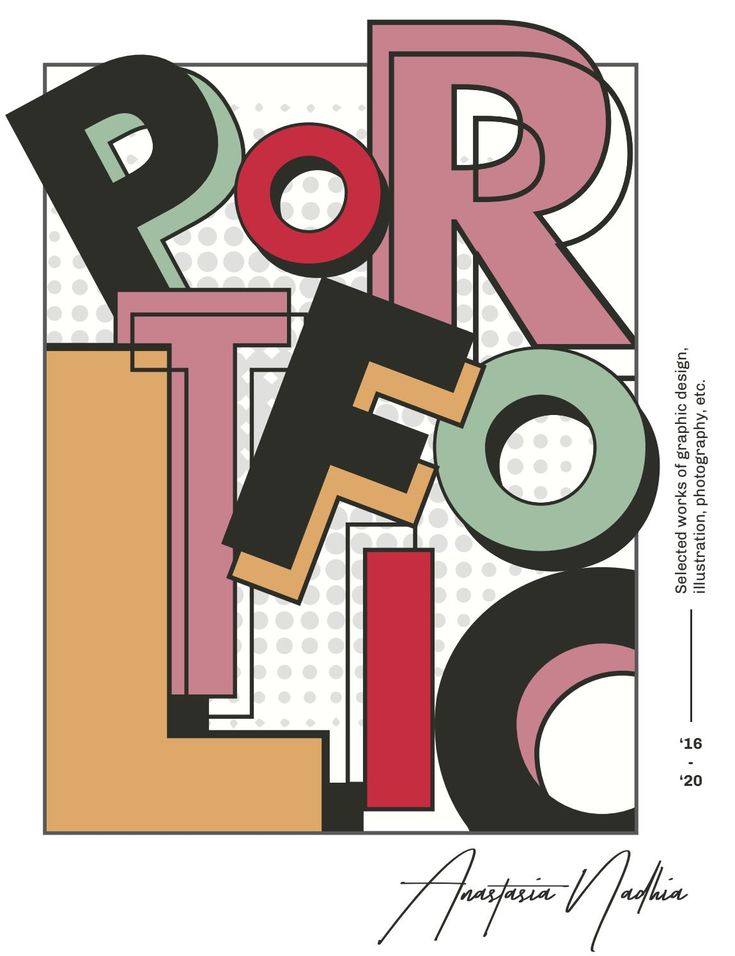
Typography is one of the most important elements of graphic design. It goes beyond simply choosing attractive fonts; it plays a significant role in communicating messages, creating visual interest, and establishing a strong brand identity. Whether designing a website, logo, advertisement, brochure, or social media post, the right typography can make a design more engaging, professional, and memorable.
In today’s visually driven digital world, typography helps designers capture attention and communicate ideas effectively. Understanding how typography works can help graphic designers create designs that leave a lasting impression on their audiences.
1. Typography Creates a Strong First Impression
The first thing people notice about a design is often its overall visual appearance. Typography contributes significantly to this first impression by establishing the mood and personality of the design.
For example, bold and modern fonts can communicate confidence and innovation, while elegant serif fonts can create a sense of tradition and sophistication. Choosing the right typeface helps designers make their intended message more appealing and meaningful.
2. Improves Readability and Visual Communication
One of the primary purposes of typography is to make information easy to read and understand. Poor font selection, inappropriate spacing, and inconsistent text sizes can make even valuable content difficult to follow.
Effective typography improves readability through:
- Choosing clear and appropriate fonts.
- Maintaining proper line spacing and letter spacing.
- Using suitable font sizes for different content sections.
- Creating sufficient contrast between text and background.
- Organizing information with clear headings and subheadings.
When text is easy to read, audiences can understand the message without unnecessary effort.
3. Builds a Recognizable Brand Identity
Typography plays an essential role in developing a consistent brand identity. Many successful brands use distinctive typography to make their names and messages recognizable.
A carefully selected typeface communicates a brand’s personality, values, and professional image. For example, a technology company may prefer clean, modern fonts, while a luxury fashion brand may choose elegant and sophisticated typography.
Using consistent fonts across websites, advertisements, packaging, and social media platforms also helps businesses create a unified brand experience.
4. Creates Visual Hierarchy in Designs
Visual hierarchy helps audiences understand which information is most important. Typography allows designers to organize content according to its importance.
Designers can establish visual hierarchy by combining different:
- Font sizes.
- Font weights.
- Font styles.
- Text colors.
- Letter spacing and alignment.
For example, a large and bold headline immediately attracts attention, while smaller supporting text provides additional information. This arrangement guides viewers through the design naturally and makes the content easier to understand.
5. Communicates Emotions and Design Personality
Different typefaces create different emotional responses. Typography can influence how people feel about a design even before they read its message.
For instance, serif fonts often communicate elegance, reliability, and tradition. Sans-serif fonts generally create a clean and contemporary appearance. Script fonts can add a personal, artistic, or decorative touch.
Graphic designers should select typography according to the purpose of the project and the emotions they want to communicate.
6. Makes Digital Designs More Engaging
Typography is particularly important in digital platforms, where users often interact with content through mobile phones, tablets, and computers.
In website design and mobile applications, effective typography improves navigation, readability, and user experience. Responsive typography ensures that text remains readable across different screen sizes.
Designers should also consider accessibility by using readable font sizes, sufficient contrast, and appropriate spacing. These practices make digital content more comfortable for a wider range of users.
7. Supports Creativity and Design Innovation
Typography provides graphic designers with numerous opportunities to experiment and express creativity. Designers can combine different typefaces, create custom lettering, use decorative fonts, and explore creative text arrangements.
Some popular typography techniques include:
- Kinetic Typography: Animated text that creates movement and visual interest.
- Experimental Typography: Unconventional arrangements and creative font combinations.
- Bold Typography: Large and strong text used to capture attention.
- Minimalist Typography: Simple and clean text arrangements that emphasize clarity.
- Custom Typography: Specially designed lettering that gives a brand or project a unique appearance.
These techniques help designers develop distinctive visual identities and make their creative work stand out.
8. Helps Create Consistency Across Marketing Materials
Consistency is essential when designing marketing materials for a business. Using too many unrelated fonts can make a brand appear unprofessional and confusing.
A well-planned typography system establishes clear rules for headings, body text, captions, and other elements. Following these rules across brochures, websites, presentations, advertisements, and social media graphics creates a consistent visual identity.
Best Practices for Using Typography in Graphic Design
To create effective and memorable designs, graphic designers should follow a few important typography practices:
- Choose fonts carefully: Select typefaces that match the purpose and personality of the project.
- Limit font combinations: Avoid using too many different fonts in one design.
- Maintain readability: Make sure text is easy to read across different devices and formats.
- Use proper spacing: Pay attention to line height, letter spacing, and margins.
- Establish hierarchy: Use different font sizes and weights to organize information.
- Maintain consistency: Follow a consistent typography style throughout the design.
- Consider accessibility: Ensure sufficient contrast and readable text sizes.
Following these practices can help designers create visually appealing and professional designs.
Conclusion
Typography is much more than a decorative element in graphic design. It is a powerful communication tool that influences readability, brand recognition, visual hierarchy, and emotional connection. The right combination of fonts, spacing, and text arrangements can transform an ordinary design into something meaningful and memorable.


